These are the questions I have to answer to evaluate my Music Magazine
Question 1) In what way does your media product use, develop or challenge forms and conventions of real media products?
Question 2) How does your media product represent particular social groups?
Question 3)what kind of media institutions might distribute your media product and why?
Question 4)who would be the audience for your media product? ?
Question 5) How did you attract/address your audience?
Question 6) What have you learnt about technologies from the process of construction this product?
Question 7) Looking back at your preliminary task, what do you feel you have learnt in the progression from it to the full product?
Wednesday, 27 March 2013
Friday, 22 March 2013
My Music Magazine Double Page Spread

Here is the finished product of my double page spread.
I used one image for the background and main image, I did this because it was very central and I thought it would look cool to have the text going round it. However, when writing up the interview, I knew the text would'nt stand out against the image, so to fix this I thought that filling in the text boxes would work. However, it doesn't look very professional having it block coloured, I wanted it to look semi-transparent but I couldn't figure out how to do this. I think I should've added more images to the double page spread because there is too much writing and I think it would've helped break it up more, making it easier to read. The interview itself is far too long and I should've shortened it down.
My Music Magazine Contents Page

Here is the finished product of my contents page.
Like the cover, I do not like it because it's very plain and minimalistic and not very eye catching. The colours are bright and bold, but the lack of things on the page makes it look nothing like real magazines.
I think I could have used more images and added pull quotes from the interviews or articles to make it look more like a real magazine. I could've put text with some of the images too, so the readers would know what the images are about.
My Music Magazine Cover

Here is my finished magazine front cover. I couldn't use the fonts I wanted so I went with a bold one that will stand out. I like the colours I used, although they do take the attention away from the main image. I used the same colours on the contents page too for continuity.
Looking at it now, I wish I'd added more sell lines and stuck to the templates I made, because it doesn't look that professional and I definitely wouldn't buy it if it was in a news agents.
I think it does't have many features that a real top selling magazine would have. It's lacking the date issue number and price. There are no puffs, buzz lines or anchorage text. There is only two images, the main one and one relating to an article in the magazine. I think there could have been another one or two images so it didn't look so bland.
Friday, 8 March 2013
Front cover photo
This is the image I have selected for the front cover of my music magazine. It will be the background image and main image of the front cover. I like it because it has space for the masthead at the top and room at the bottom for the covermount and barcode etc.
The studioshot is of the girlband Failing Chemistry, so it links with the main feature of the issue which is an interview with the band.

Here is the original and the finished image after editing it. To get the image like this, I reduced the saturation making it look not quite black and white with a little bit of colour. It also made the background a lot more white and not the creamy white in the original image.

Wednesday, 6 March 2013
Short list of photos
This is my photoshoot with Failing Chemistry, the girlband. I used a photography studio to get the high key lighting I wanted.
Out of 200, these are the few images I might include in my magazine.
I just need to edit the ones I will use.


I quite like this one, I think the contents is good and they all look happy and cheerful. However, it isn't spaced that well and the girl on the left isn't fully in frame (her hands are cut out). Also, there is too much space on the right side compared to the left so they aren't even.


This one is also nice, the content is good and they look like they are having fun. However, again the girl on the left is being cut out of frame, meaning they are too close to the camera or I needed to zoom out. There is movement in this shot and it's made it blurry. This could be because they weren't ready for the shot or I had the wrong shutter speed.

I think I will use this one for my cover, it is spaced nicely and the content is good. I would edit it before use though, because there is shadow in the corners and the background isn't quite white enough. I like the pose and how they are dressed as it shows their individual styles and that was what the aim of this shoot was for.


This one is a little bit overexposed but I really like it. I will edit out the feet (it's not very professional). I like how they are spaced out on the floor, even if I could have moved around a little to get their faces right in the middle. I might use this one for my double page spread as I think its quite nice.


I quite like this one, even though the lighting isn't that good. I like how the three are sitting in front with the sign and the other dressed in the dinosaur onesie is pulling a funny face behind them. I think I could have moved them further back, so part of their arms weren't cut out of frame. If I were to use it, I would need to adjust the brightness and contrast to balance them out.


Friday, 1 March 2013
Photoshoot
I have done my photoshoot for the Music Magazine, but the 'British Heritage' theme had to change as I couldn't use the original location (library). I carried out my photoshoot in a photography studio so I could get the proper high key lighting and now all I have to do is select the ones I will use.
Wednesday, 20 February 2013
Inspiration for Photoshoot
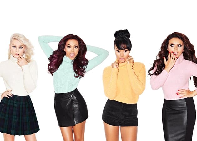


These are images of the girlgroups Little Mix, Stooshe and The Saturdays and it's who Failing Chemistry get their inspiration from. I would like my photoshoot to be high key, if possible and I will use a photography studio to take the images to get the proper high key lighting. I like the one of Stooshe where it looks like a cartoon, I think that would look quite cool if I tried it. I also like the desaturated ones of Little Mix and The Saturdays, I like how they look sort of black and white, but certain parts are coloured. I will use these for inspiration for my photoshoot.


Questions for Music Magazine Interview
These are the questions I would ask the band for the double page spread, although they are not in order. I have decided to make it a Valentine's Day special, so I will ask them questions about their music and some related to the theme of the issue.
How did you become a band?
You're aYouTube band, but will you ever do live gigs?
(Interlinking question with answer)
If you could play anywhere in the world, where would it be?
You mainly sing covers, do you write your own material too?
You are more acoustic than other girlbands, but what makes you more different?
(Interlinking question with answer)
How long have you wanted to be musicians?
How long have you girls been together?
What are your roles in the band? Who is the most organised, laziest, craziest, loudest etc?
Do you have nicknames for each other?
Do any of you have other talents or hobbies?
Who has the worst habbits?
What is your favourite love song and romantic movie?
Who are your celebrity crushes?
What would be the pefrect date?
What would be the ideal Valentine's gift?
What is your worst romantic memory?
Who would you most like to collaborate with?
Where do you hope to be in the future?
Wednesday, 9 January 2013
Music magazine analysis
Q magazine has already reached it's 200th edition since it was first published in October 1986. It is published monthly in the UK. It is known for its red and white logo that is always in the top left-hand corner. It makes it easier to find in a news agents and is easily identifiable.


NME stands for 'New Musical Express' as it was originally a newspaper dedicated to music when it was first published in March 1952. It slowly started to become a music magazine in 1998. It mainly uses the same layout in each issue, but the masthead colour sometimes changes to match the cover image. NME magazine is easily identified from the masthead, so it stands out and is easy to find in a news agents.


Vibe is more of a R&B and hip-hop magazine. It stopped publishing in 2009, but was re-purchased and is now issued online every other month online. It uses the same masthead and bold colours so its easily recognized and the sell lines match the colours and fonts on the cover.


Billboard is an internationsal magazine devoted to music and the music industry. It was first published in November 1894, when it was originally for advertisements. In the 1930's it started publishing music charts and that is how it became a music magazine. The masthead is easily recognized for its black and white writing with the filled in colours red, yellow, blue and green. It has the same layout most of the time, with a central image that overlaps the masthead and the sell lines and other writing on the cover.


Kerrang! magazine was first published in June 1981 as a one-off supplement to 'Sounds' newspaper. It is a rock music magazine and the design/font of the masthead goes with the them, as does the colours they use for that black, white and red. The masthead makes it recognizable.

Template for my music magazine
These are photos of my drawn up templates for my music magazine front cover and double page spread.

These are the plans for my music magazine front cover. I think I prefer the second one to the first as there will be a lot of things to persuade potential readers into buying it. The first one is a bit plain compared to the second, so the cover image would need to be very eye catching to grab the readers attention.


These are plans for the layout of my double page spread. I quite like both of them, though I'm not sure which one I prefer yet. The first one gives the reader a a little bit of text but half of the double page spread is taken up by the main image (poster). I think it looks more like a newspaper article and not a teenage music magazine article. I think it's because I used a standfirst and a byline. I like having the two smaller images between the body text, it would give the reader something to look at. The second one I think is a bit more balanced, there is a lot more text and there are two images. I like having a quote in the middle of the text body, so it stands out and would make the reader want to read more. One thing I did forget to do is put in page numbers, so I would need to do that when I actually make the double page spread.

Tuesday, 8 January 2013
Moving on!
I am now moving on to the main part of my media course, which is making a front cover, content page and a double page spread for a music magazine.
I have decided that my magazine is targeted at teenagers, maybe teenage girls like We love Pop magazine or Bliss etc.
Names I am considering:
Parade
Standing Ovation
Encore
Bass line
Plectrum
Unsigned
The main feature will be an exclusive interview with local four piece girl band Failing Chemistry.
I have to use at least four of my very own images. The photo shoot will hopefully be in a library or something, I want the theme to be very British heritage.
Subscribe to:
Posts (Atom)